
Branding
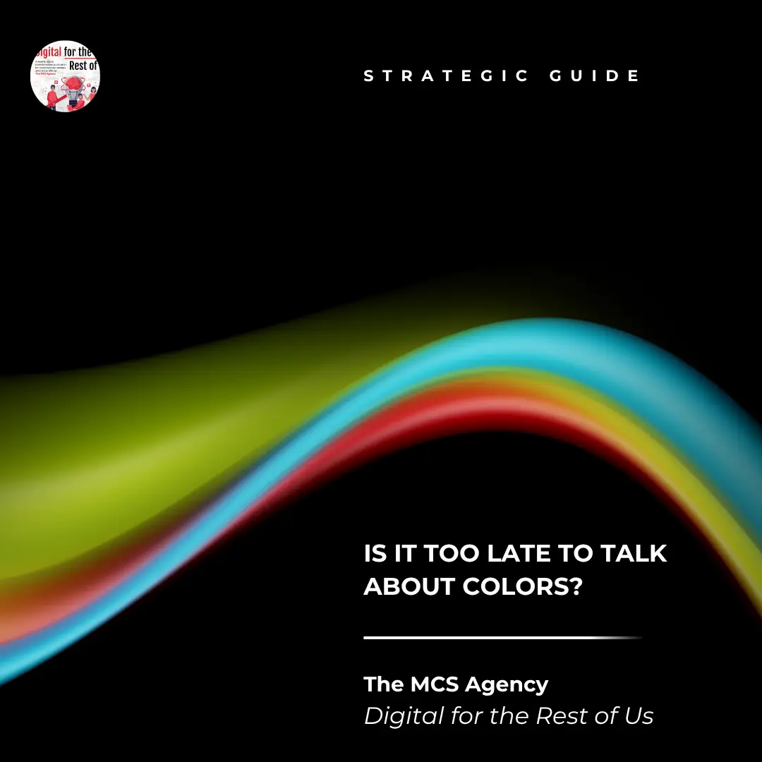
Is It Too Late to Talk About Colors?
 By Clara MatonhodzePublished
If your brand feels “off,” inconsistent, or hard to recognize across platforms, chances are your color palette might be part of the problem.
You’ve launched the programs. You’ve built community trust. Maybe you’ve even had the same logo since your first grant cycle. So when someone brings up brand colors, the gut reaction is often:
“Aren’t we past that?”
But here’s the thing – your colors speak; even when you don’t.
A few months ago, I was working with a community arts nonprofit that had been around for over a decade. Their programming was vibrant, inclusive, and deeply rooted in local culture. But their brand? A tired teal and gray color scheme that hadn’t changed since 2012. It didn’t reflect their energy, or the creative passion that lit up every corner of their workshops.
We explored deeper into who they were—and one day during a brand session, someone literally said, “I think we’re trying to show up as blue, but blue just ain’t our color.”
And yes, cue Keith Urban: “Blue Ain’t Your Color.”
We laughed, but it stuck. Because sometimes your brand starts to wear a color that no longer fits. It’s familiar, it’s safe—but it’s not you.
Color Isn’t Decoration. It’s Emotion.
Cyndi Lauper had it right: “I see your true colors, and that’s why I love you.”
People connect with authenticity. That connection starts visually, often before a word is read. Your color palette sets the emotional tone. It can invite or repel. Energize or confuse. Build trust or raise eyebrows.
Think about United Colors of Benetton (I know I’m dating myself here, but what’s great is timeless); they didn’t just use color for design; they used it to make a statement. Their bold, vibrant campaigns weren’t about looking pretty—they were about provoking thought, sparking conversation, and aligning with global inclusivity. The colors stood for something.
That’s the kind of intentionality nonprofits and small businesses can borrow. Color shouldn’t be about what’s trendy, but about what’s true. (I see you Insta influencers, and everyone on the beige aesthetic 🙂

But What If You’ve Already Picked a Palette?
Then you’re in the same boat as most of our clients.
Colors often get chosen quickly out of a Canva template, from a designer friend, or just based on what “looked good.” And there’s no shame in that. However, when your organization begins to evolve, when your mission becomes sharper, your audience shifts, or your impact deepens, your visuals must evolve as well.
I once worked with a leadership coach who had built her business with soft blues and grays. They were peaceful, professional… but didn’t reflect the bold, transformative work she was doing. We explored deeper. Her passion? Equity, empowerment, and helping people rise.
We reimagined her brand in deep crimson and gold tones. That red? It didn’t just look good—it pulsed with passion. It made her message land harder. People started saying, “You look like your work feels.”
That’s what happens when your colors match your mission.
Want to Know What Your Color Is Saying?
You might be wearing a color that no longer suits you. Or maybe you’ve never stopped to ask what colors truly reflect your values, audience, and personality.
That’s why we created a fun, thoughtful quiz called ” What’s Your Organization’s True Color?
In just a few minutes, you’ll uncover the color family that aligns with your mission and get insights into how color can support your visibility, messaging, and emotional impact.
It’s not just about looking good. It’s about showing up in a way that feels aligned and helps others feel your mission before they even read a word.
👉[Take the Quiz Now]and discover the color that’s always been yours.
Because when you show your true colors, people don’t just see you—they remember you.
Get Digital for the Rest of Us™
One practical question a small team faces, answered in plain language every other week.