

Dayton Daily News
VOICES: HIV diagnosis still brings stigma, legal complications.
FeatureCase studies
How The MCS Agency helps nonprofits turn growing programs, stories and complex data into one clear picture.
The MCS Agency built a brand system for a Cincinnati clinical lab that has since seen more client intake and referrals, rebuilt the identity of a children’s relief organization whose donations are up 25 percent, unified the brand of a food nonprofit that grew from 3 staff to 10, turned legal data into a map for a statewide health report, and grew Facebook views for Hosea House, a Northern Kentucky soup kitchen, by 139 percent and then another 46.8 percent.
The work
Each case study follows the same path: who the client is, what they needed, what we made and what changed. Pick one to jump straight to it.
Brand identity · Healthcare
A clinical-grade brand system for a Cincinnati diagnostic lab.
Moreclient intake and referrals since the rebrand
Read the case study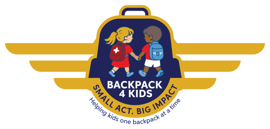
Rebrand · Nonprofit
A scalable identity for a children’s relief organization, built from its original sketch.
+25%in donations since the rebrand
Read the case study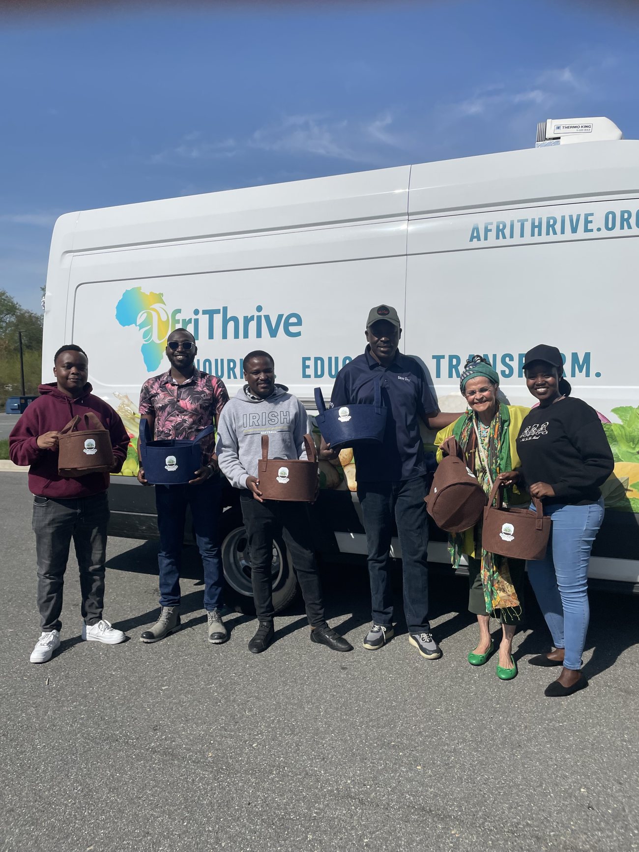
Brand and outreach · Nonprofit
One brand and one voice for a fast-growing food mission.
3 → 10full-time staff
Read the case study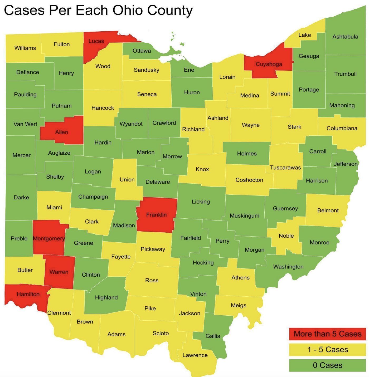
Data visualization · Policy
A county-level HIV criminalization map, a full campaign toolkit and coverage across Ohio’s newsrooms.
88Ohio counties mapped
Read the case study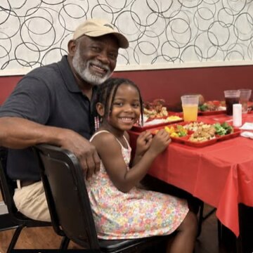
Social media · Nonprofit
Photo-led storytelling for a Northern Kentucky soup kitchen.
260.4KFacebook views in the latest 90 days, up 46.8%
Read the case studyCase study 01 / 05
A clinical-grade brand system for a Cincinnati diagnostic lab, from logo to waiting room.
Client
The diagnostic laboratory division of Wi Care Health Services, a Cincinnati healthcare company.
What we did
01
Wi Care serves patients, physicians, urgent care centers, nursing homes and schools across the Cincinnati area, with fast turnaround, mobile phlebotomy and walk-in access. It needed every touchpoint, from a business card to a website to a phone call, to say the same thing: expert, accessible, fast and rooted in Cincinnati.
02
We built the brand foundation and wrote it into a guide for designers, vendors, staff and partners: positioning and values, the logo system, color palette, typography, voice and tone, tagline options, audience messaging and a language reference.
03
Since the rebrand, Wi Care has seen an increase in client intake and referrals. Everyone who produces materials on its behalf now works from one reference for how the brand looks and sounds.
Before and after
BEFORE
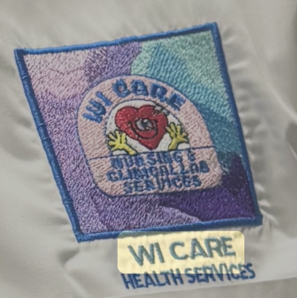
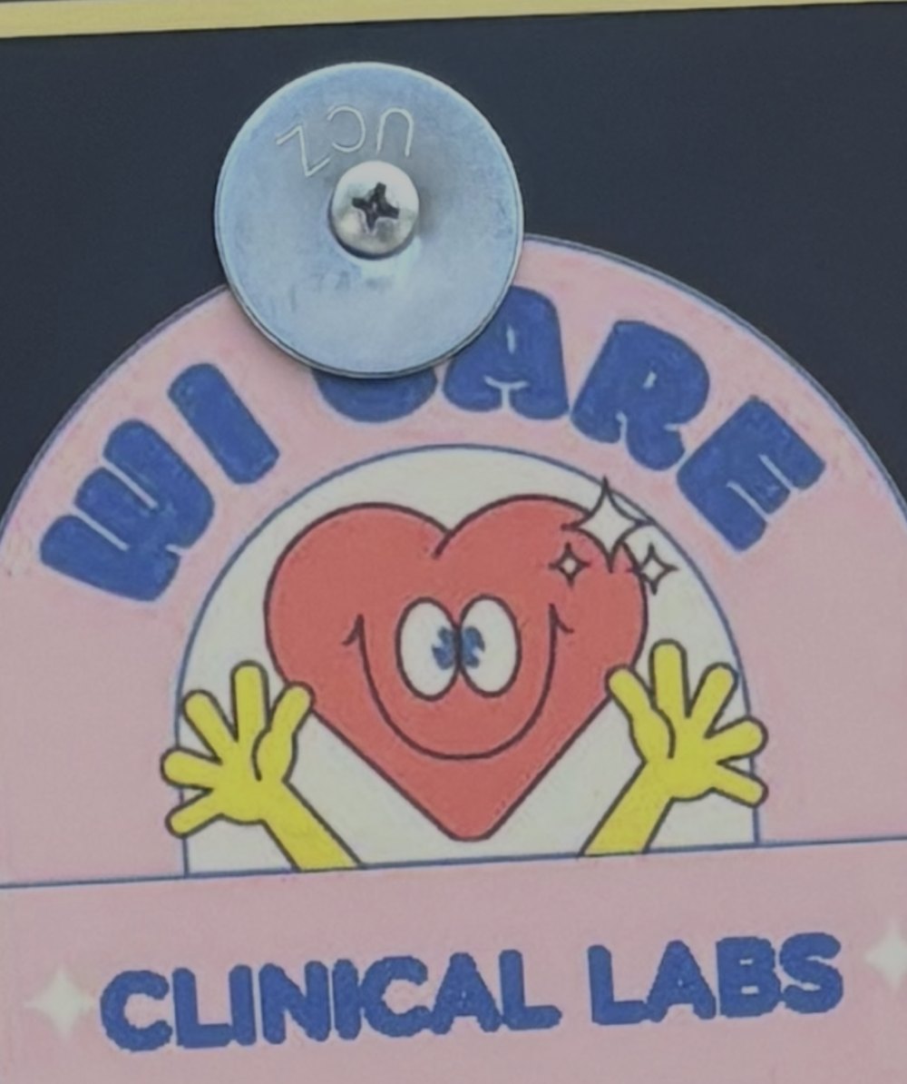
Earlier materials used a smiling heart with raised hands.
AFTER
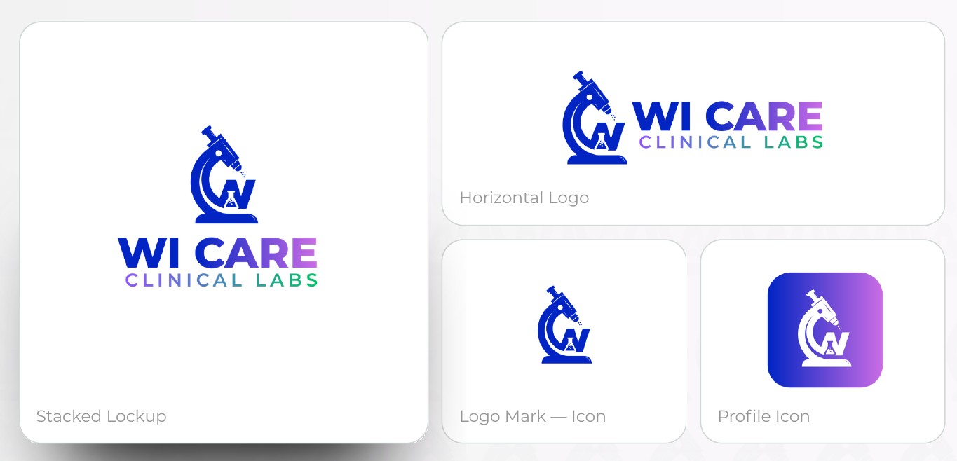
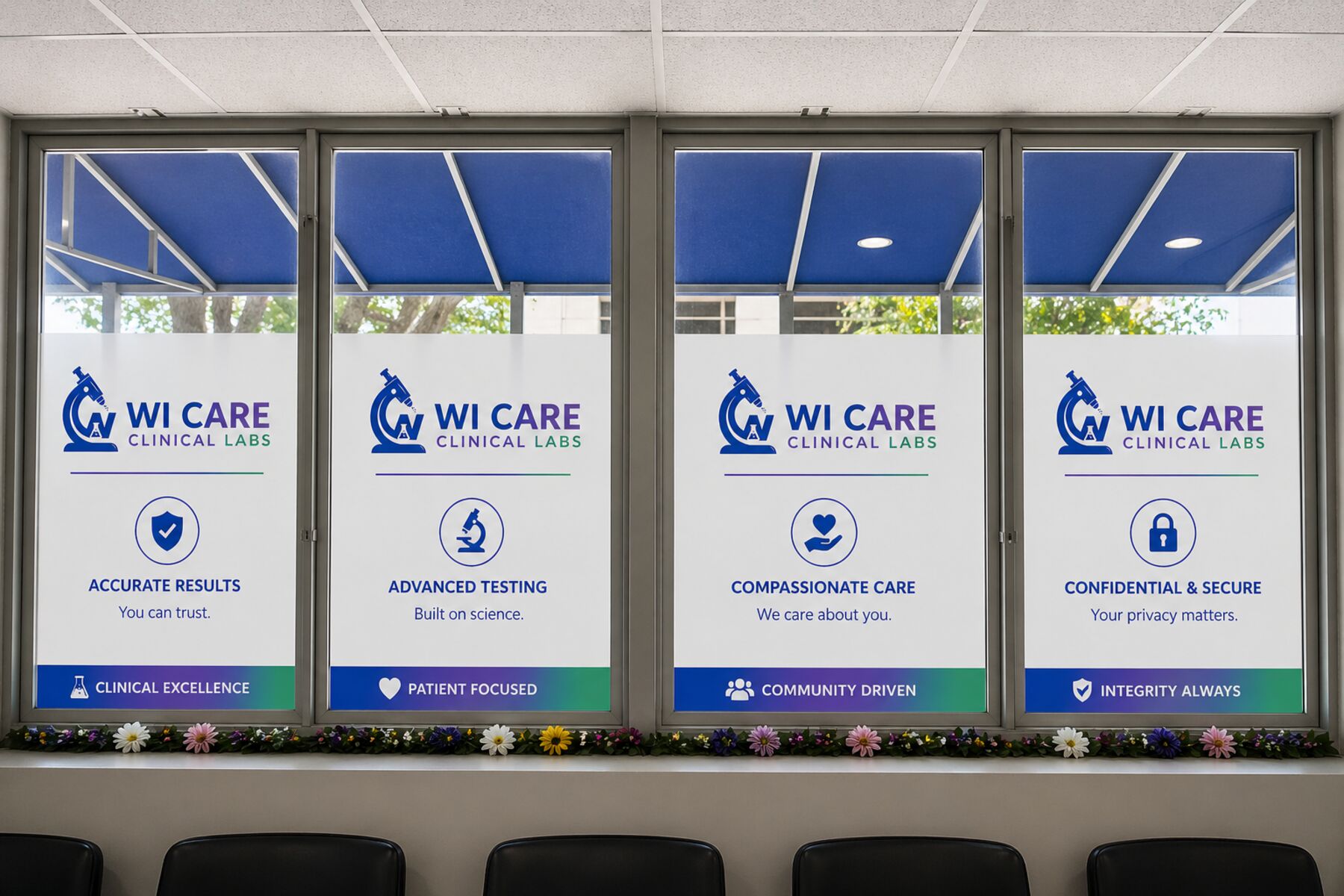
A microscope, a W and a beaker form one mark, in stacked and horizontal lockups, an icon and a profile icon.
Inside the brand guidelines
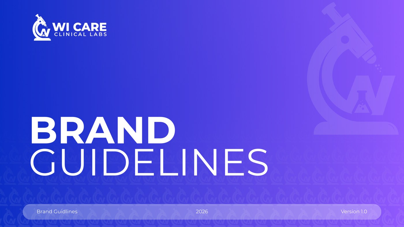
01
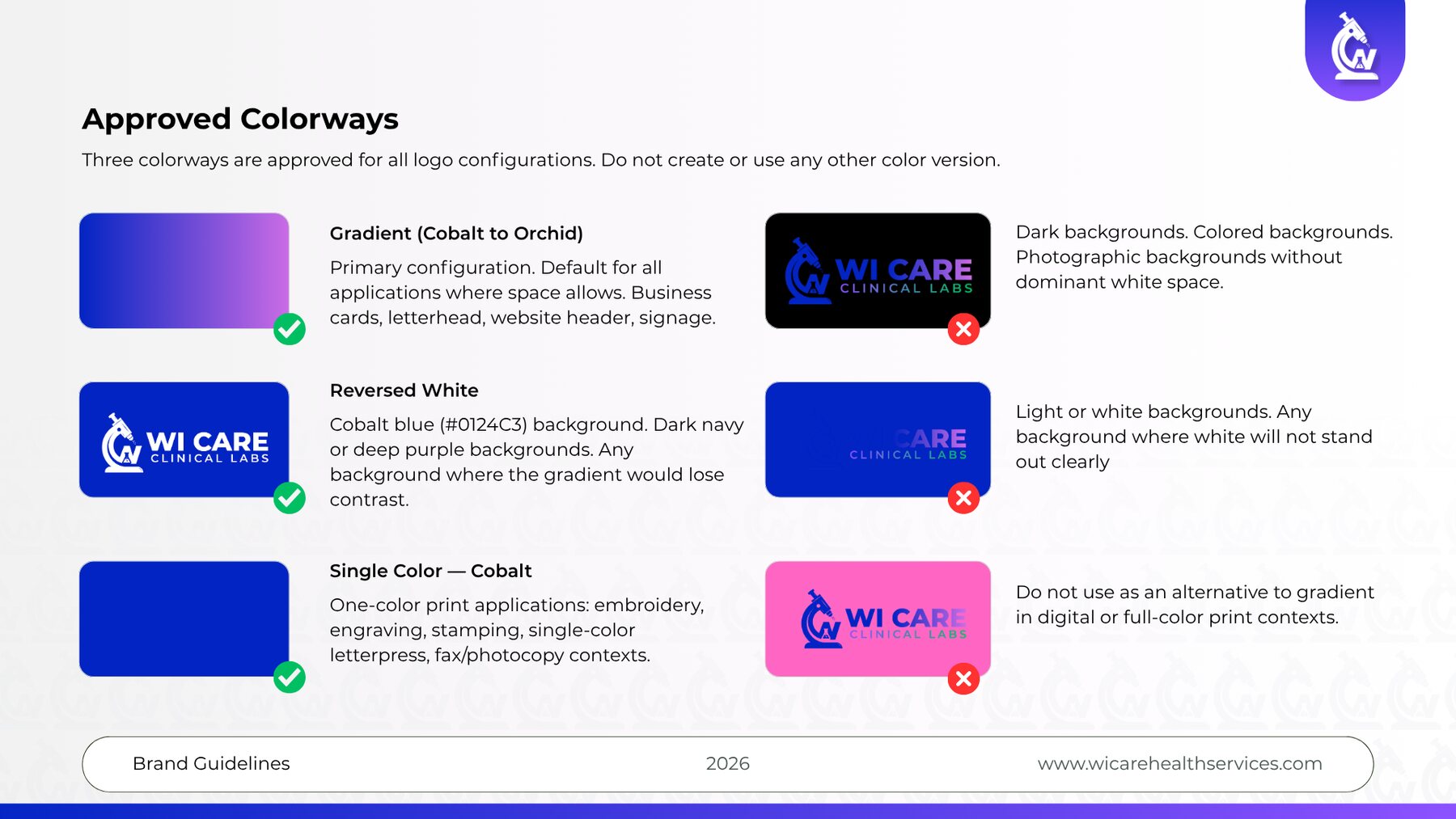
A microscope silhouette, a W and a beaker form one mark, offered in four configurations and three approved colorways.
02
Cobalt blue (#0124C3) anchors the identity, with a cobalt-to-orchid gradient reserved for the logo and neutrals for readability, at a 4.5 to 1 minimum contrast for body text.
03
Montserrat carries every touchpoint, with hierarchy set by weight alone.
04
Tone guidance, tagline options and messaging for each audience keep every communication consistent.
Case study 02 / 05
A brand carried by care: a scalable identity for a children’s relief organization, rooted in its original sketch.
Client
A nonprofit that provides emergency backpacks to children affected by crises.
What we did
BEFORE
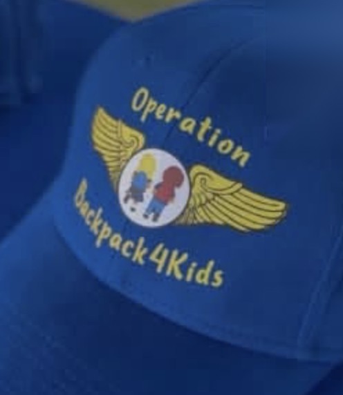
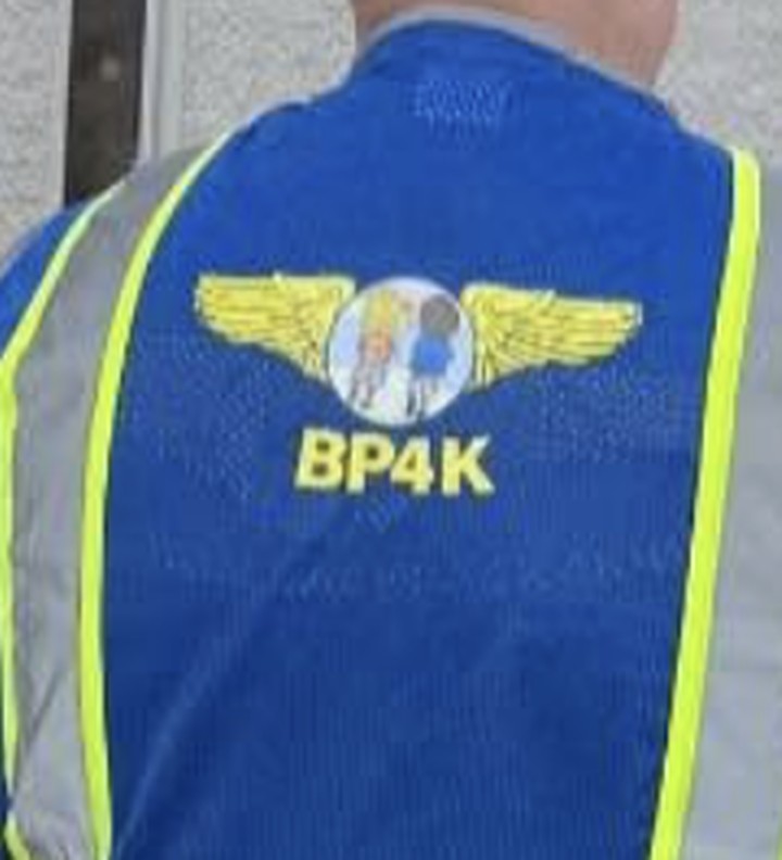
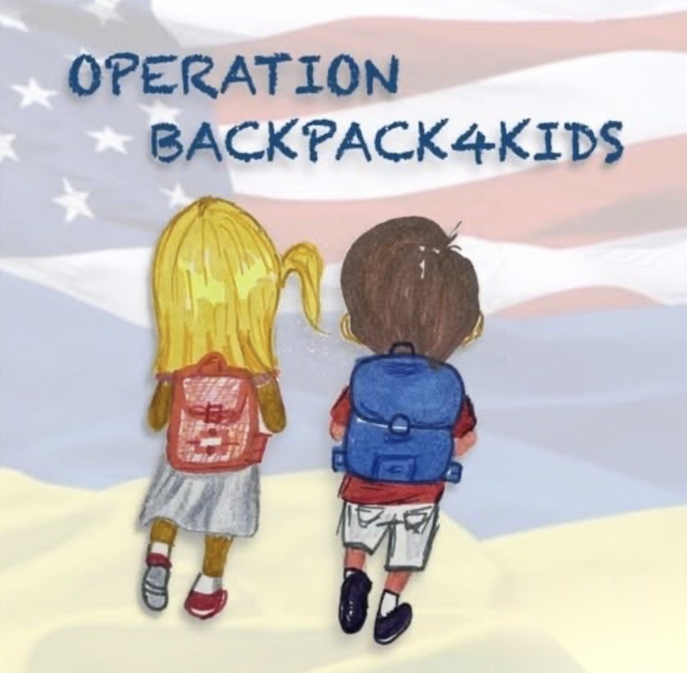
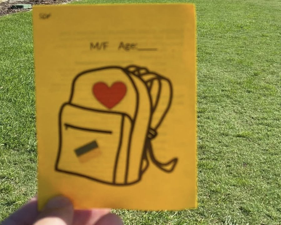
Early caps, vests, artwork and forms each carried a slightly different mark.
AFTER
One identity for digital, print, merchandise and packaging.
“Her team listened closely, helped us articulate what we had been struggling to say and shaped a brand story that finally sounded like us.”
01
The early logo placed two children inside a blue oval flanked by aviation-style golden wings. It was meaningful and recognizable, but hard to use across materials. BackPack4Kids needed a brand that reflected where it was going, professional and recognizable, while still centering the children.
02
The MCS Agency took on the full transformation, from brand identity to marketing ecosystem: logo, website, brochures, one-pagers, presentations, a fundraising pitch deck, social templates and a messaging strategy. Every piece stayed true to the original sketch and the story behind it.
03
Donations are up 25 percent since the rebrand. The identity now works across digital, print, merchandise and packaging, the story is easier to tell, and every platform says the same thing: this backpack was packed with care, and you are not forgotten.
The story behind the brand
While stationed in Germany, Bill Vaughn watched refugee children arrive with no supplies and no bags, only the clothes they wore. His idea was simple: give each child a backpack filled with hygiene items, books, clothing and a quiet message, you matter.
Stacey helped turn that instinct into an operating model, recruiting pilot volunteers and coordinating delivery. One early volunteer drew two children walking hand in hand, backpacks on their shoulders. That drawing became the visual heart of the organization.
“What stuck with me were the kids. The kids who had nothing of their own. It felt wrong. I couldn’t shake it.”
The new identity
01
Always hand in hand, as in the original sketch. They stand for dignity, companionship and forward motion.
02
The children now appear inside the outline of a backpack, the central tool of the mission.
03
Refined aviation symbolism that honors the program’s origin among volunteer pilots.
04
A clear, modern typeface paired with the tagline Small Act. BIG IMPACT.
Case study 03 / 05
One brand and one voice for a food mission that grew from a parking lot to a building of its own.
Client
A nonprofit strengthening African immigrant families through food, economic opportunity and culturally rooted programs.
What we did
01
As AfriThrive grew to include multi-county food distributions, urban farming and integration programs, it ran several initiatives with limited communications capacity. Its messaging was fragmented, its visual identity varied from piece to piece, and digital engagement was low.
02
03
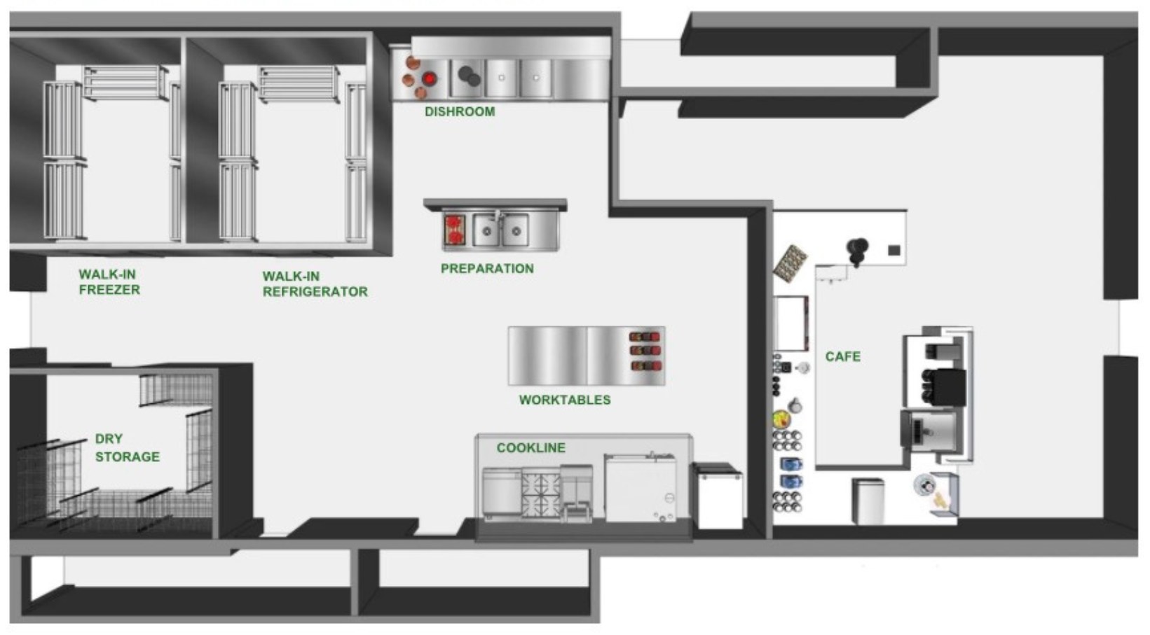
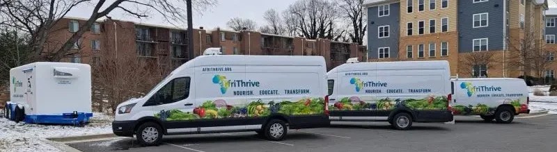
AfriThrive grew from 3 staff and a single truck distributing food in a parking lot to 10 full-time staff, a federal grant, a fleet of three trucks, cold storage and plans to break ground on its own building. Its brand now presents that growth in one consistent voice.
Then and now
WHEN WE STARTED
TODAY
LinkedIn figures: AfriThrive’s LinkedIn analytics, 2025, all organic. The top post, an International Women’s Day feature on real women from the community, drew 3.0K views.
Case study 04 / 05
A statewide campaign to modernize Ohio’s HIV laws: a county-level map people can read, a full set of campaign materials and a message that carried into newsrooms across the state.
Client
A statewide initiative working to modernize Ohio’s HIV laws, whose final report examined HIV criminalization across the state.
What we did
From the final report
Every Ohio county was sorted into one of three categories, so readers can see at a glance where HIV-related criminal cases were recorded.
Aggregate counts only, so no individual can be identified. Reporting practices vary from county to county.
01
The Ohio Health Modernization Movement needed to show where HIV-related criminal cases were recorded across Ohio’s counties, and to make the case for reform to lawmakers, the press and the public in plain language.
02
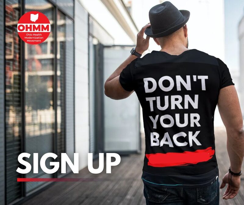
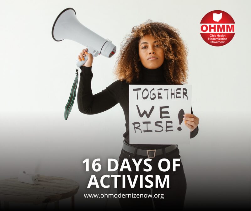
We gathered case counts for each county from public records and legal databases, sorted every county into one of three categories and overlaid the results on a GIS map, showing aggregate counts only. Then we built one identity across the toolkit, fact sheet, rack card, media protocol and social posts.
03
The map became an exhibit in the movement’s final report for public health officials, legal advocates and community organizations. Doctors, advocates and people living with HIV carried the message into newspapers, public radio and TV across Ohio.
OHMM news coverage









Op-eds and features in Ohio newspapers
VOICES: HIV diagnosis still brings stigma, legal complications.
Feature
Doctors Carlos Malvestutto and Michael Para say anti-science Ohio laws perpetuate fear, sending innocent people with HIV to jail.
Op-ed
For the good of all of us, it is time we modernize HIV laws, writes infectious disease expert Dr. Carl Fichtenbaum.
Op-ed
Let’s end the HIV epidemic, urges Dr. Yasmin Bradley. The present looks far better than the past.
Op-ed
Kent woman Kimberley Gantz, living with HIV for 18 years, urges updates to Ohio laws.
Op-ed
Ohio law codifies fear and discrimination for people living with HIV/AIDS, argues Graig Cote, an advocate for more than 30 years.
Op-ed
Ohio HIV laws must catch up with science and society, say Drs. Barbara Gripshover and Ann Avery, infectious disease specialists in Cleveland.
Op-edMedical advances can make people with HIV nontransmissible if they know their status and seek treatment, writes the editorial board of Cleveland.com and The Plain Dealer.
Editorial
Naimah O’Neal has lived with HIV for 30 years, since her diagnosis in 1992 at the age of 29.
FeatureRadio, video and podcast coverage
Campaign materials
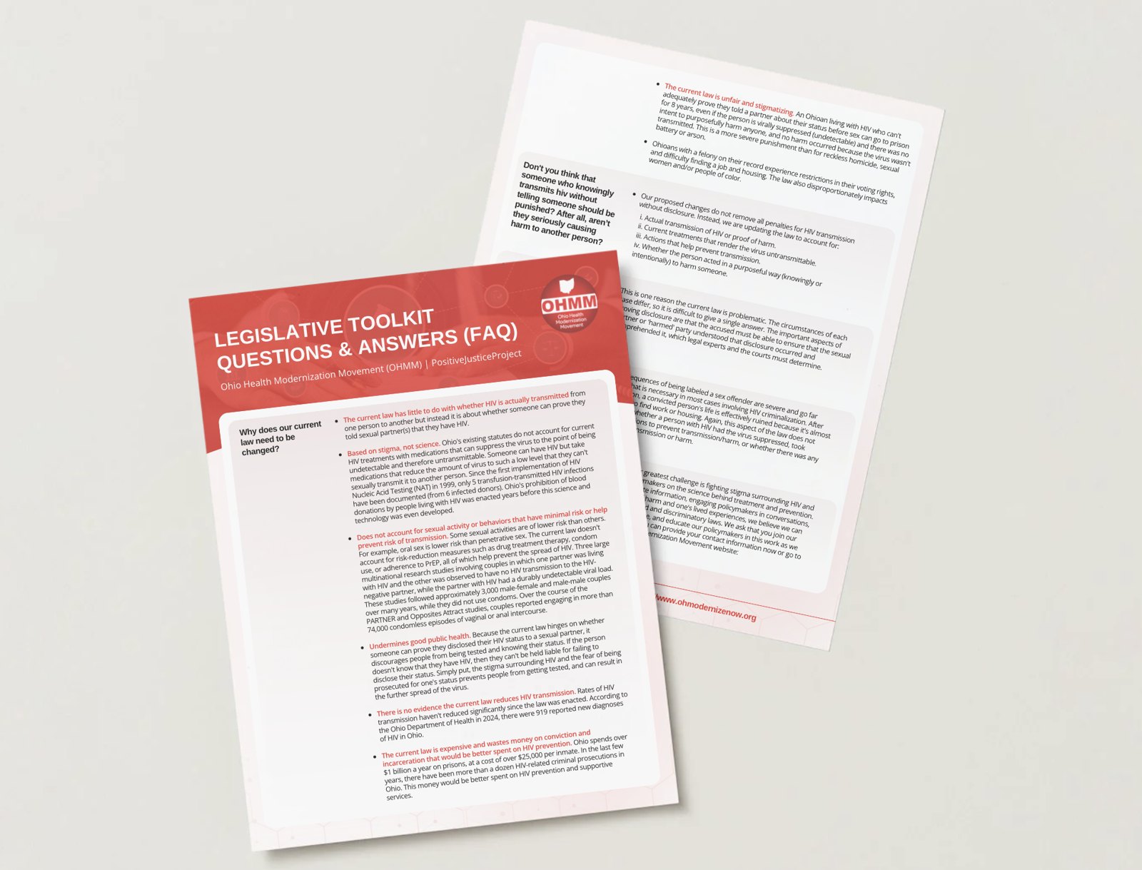
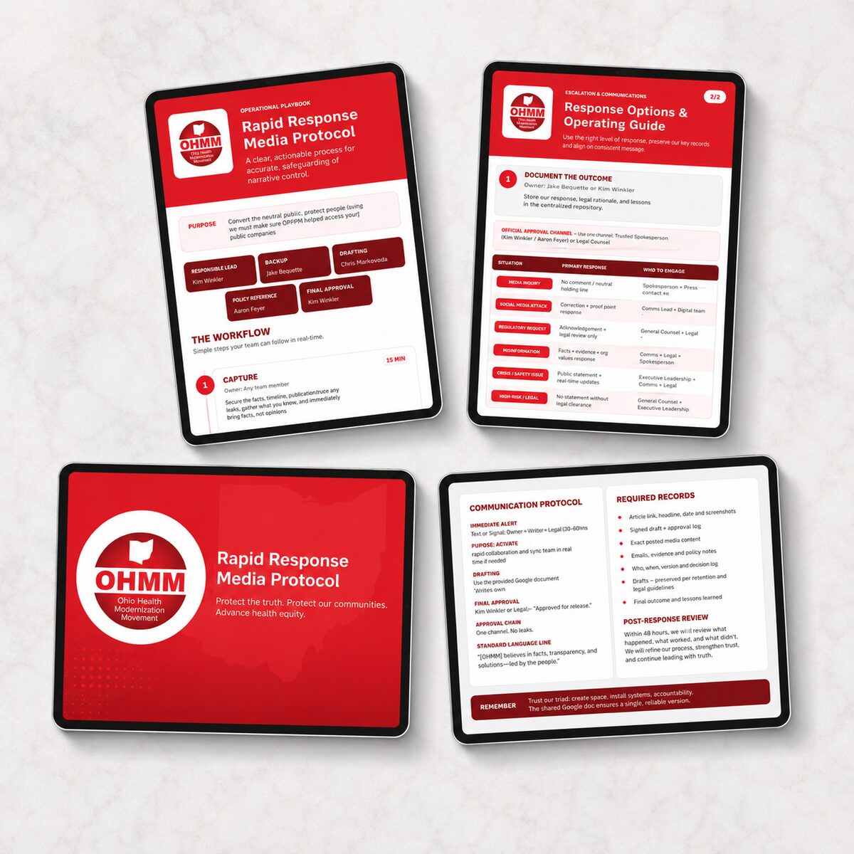
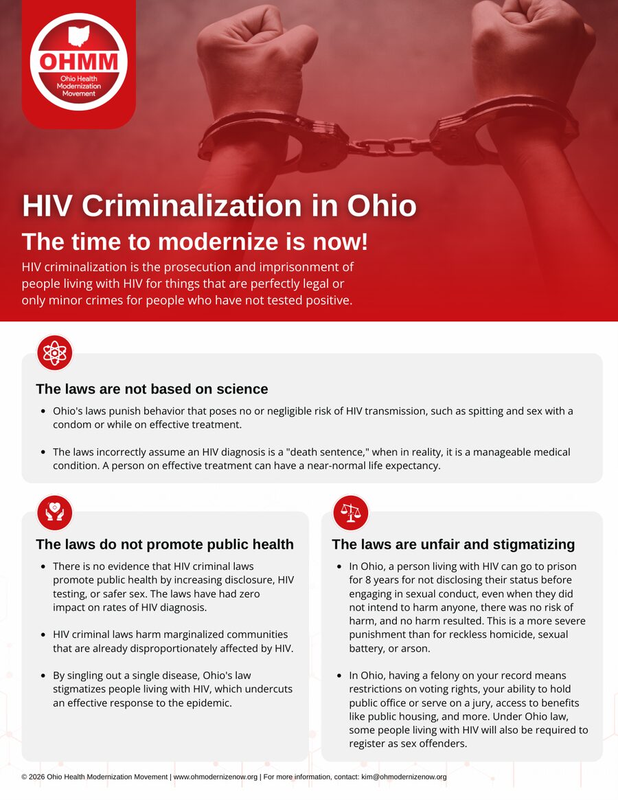
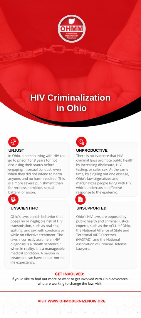
Case study 05 / 05
Photo-led storytelling that turned a Northern Kentucky soup kitchen’s Facebook page into the place neighbors, volunteers and donors show up every evening.
Client
Henry Hosea House, a community meal program on York Street in Newport, Kentucky, serving a hot dinner to neighbors in need every evening.
What we did
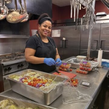
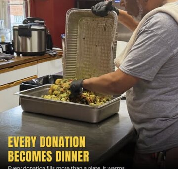
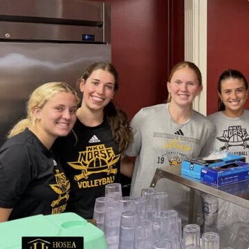
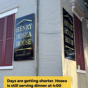
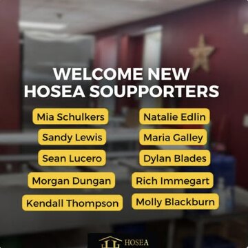
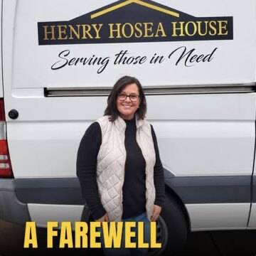
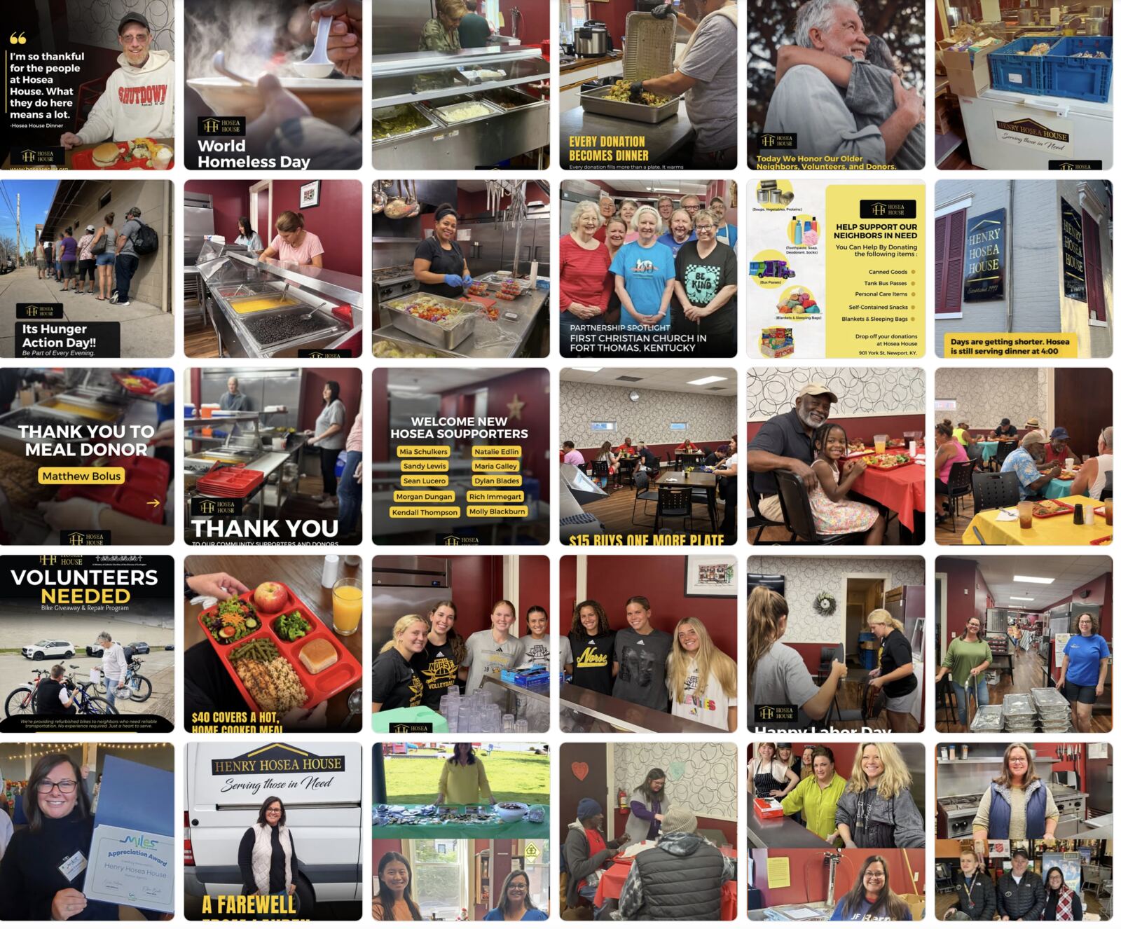
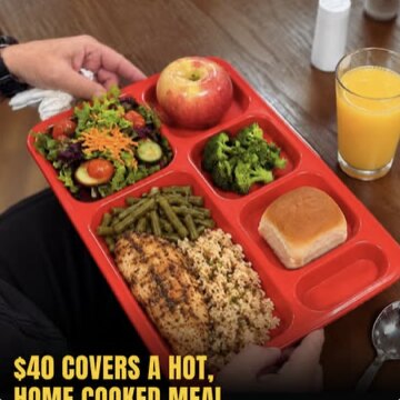
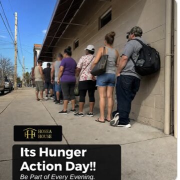
Posts from the Hosea House Facebook page: real neighbors, volunteers and kitchen moments, in a consistent black-and-gold frame. See a wider view of the feed
Latest 90 days
July 16 to October 13, 2026, compared with the previous 90 days
01
Hosea House wanted its Facebook page to show the people and community moments behind every dinner it serves, and to reach neighbors, volunteers and donors beyond the people who already followed it.
02
We manage the page with content built around real people. We plan and publish posts about dinner service, volunteers and guests, frame each post in the Hosea House black and gold, pair donation asks with clear price points, and use the results to shape the next round of posts.
03
The page grew two quarters in a row. Views rose 139 percent in our first 90 days, then rose another 46.8 percent on top of that to 260.4K, with more people reached, more interactions and more clicks through to the website.
Growth that compounds
April 22 to July 20, 2026
177,657views, up 139%July 16 to October 13, 2026
260.4Kviews, up another 46.8%What we post
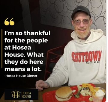
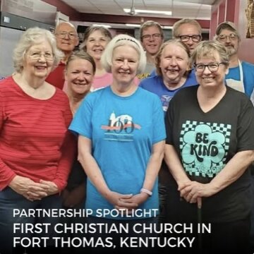
The proof
The figures on this page come from the Hosea House Facebook professional dashboard. Views peaked in mid-August, when posts traveled well past the page’s usual audience, and the page has held a steady baseline of views and interactions since.
For a meal program, reach matters in practical ways. Every post is a chance to recruit a volunteer, ask for a needed item or remind a neighbor that dinner is served at 4:00.
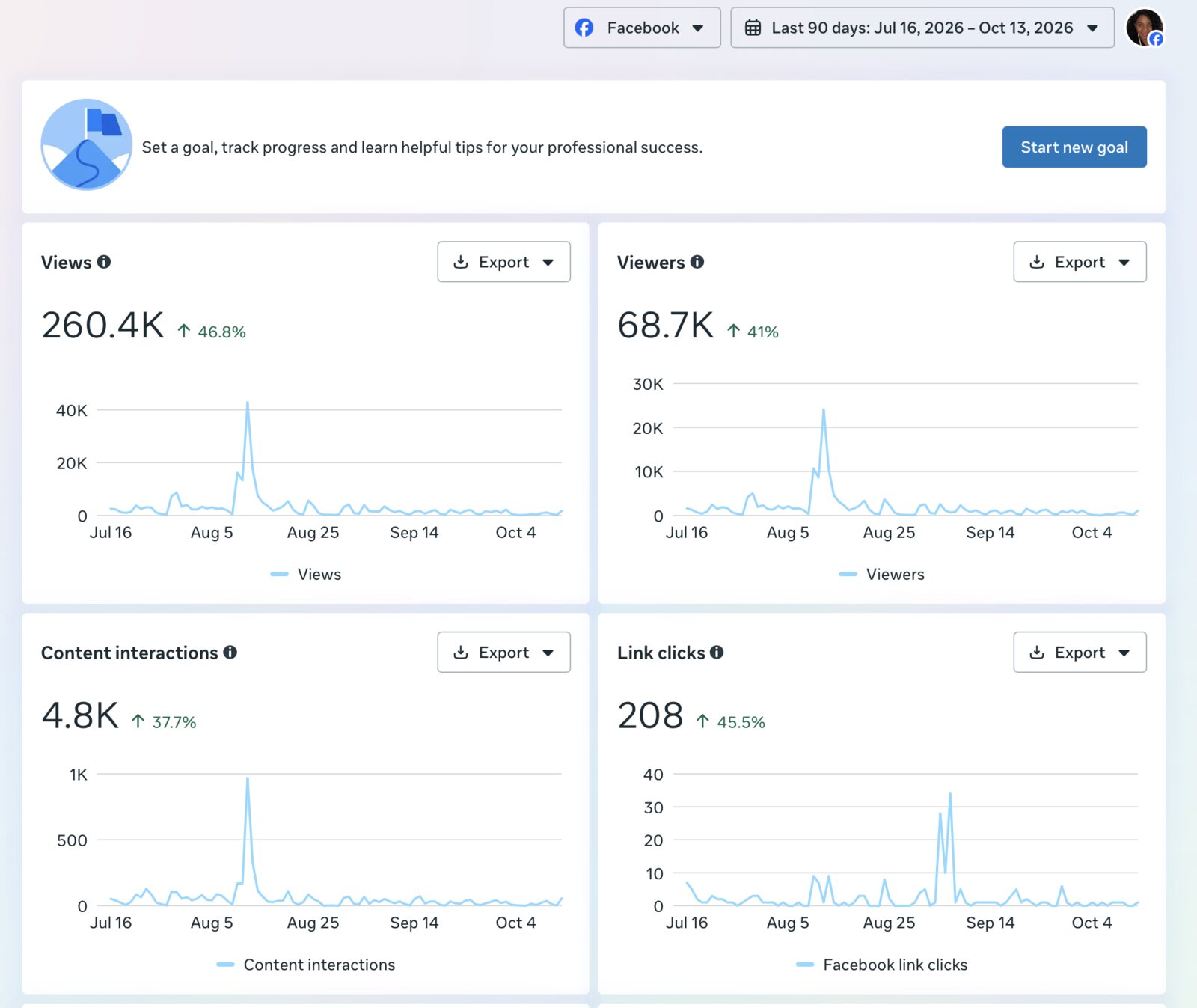
Source: the Hosea House Facebook professional dashboard, April 22 to July 20, 2026, and July 16 to October 13, 2026, all organic. Percent changes compare each period with the 90 days before it.
Back to all case studiesQuestions
The MCS Agency builds brands, websites, communications strategy and social media programs for nonprofits, and it turns complex information into clear visuals. These case studies show that work for AfriThrive, BackPack4Kids and the Ohio Health Modernization Movement.
We redesigned the logo, built the website, produced brochures, one-pagers and presentation materials, created a fundraising pitch deck, and delivered social media templates and a messaging strategy, all anchored in the organization’s origin story. Donations are up 25 percent since the rebrand.
AfriThrive grew from a staff of 3 and one truck distributing food in a parking lot to 10 full-time staff, a federal grant, a fleet of three trucks, cold storage and plans to break ground on its own building. Its brand now presents that growth in one consistent voice.
We refined AfriThrive’s messaging, refreshed its visual identity and aligned its outreach across all programs, so funders, families and partners see one consistent brand.
It was a county-level map showing where HIV-related criminal cases were recorded across Ohio, built from public records and used as an exhibit in the final report for the Ohio Health Modernization Movement. It shows aggregate counts only and identifies no individuals.
In our first 90 days in 2026, views on the Hosea House Facebook page rose 139 percent to 177,657 and engagement rose 175 percent, with 78 percent of views coming from people who did not yet follow the page. In the next 90 days, July 16 to October 13, views rose another 46.8 percent to 260.4K, people reached rose 41 percent and link clicks rose 45.5 percent.
We built the brand foundation for the Cincinnati lab and wrote it into a guide: positioning and values, a logo system, color palette, typography, voice and tone, taglines and audience messaging. Client intake and referrals have increased since the rebrand.
Yes. Start a conversation and tell us about your organization, and we will share the examples that fit.
Tell us about your organization and the team you have today.
Start a conversation